Re-design the Devices site to improve feature discoverability and task health
Users visit Devices to manage their laptops, mobile phones, and anything else they use for work. However, 51% of users shared that they struggle to find what they need. My goal was to design a scalable solution that improves discoverability of features and task completion.
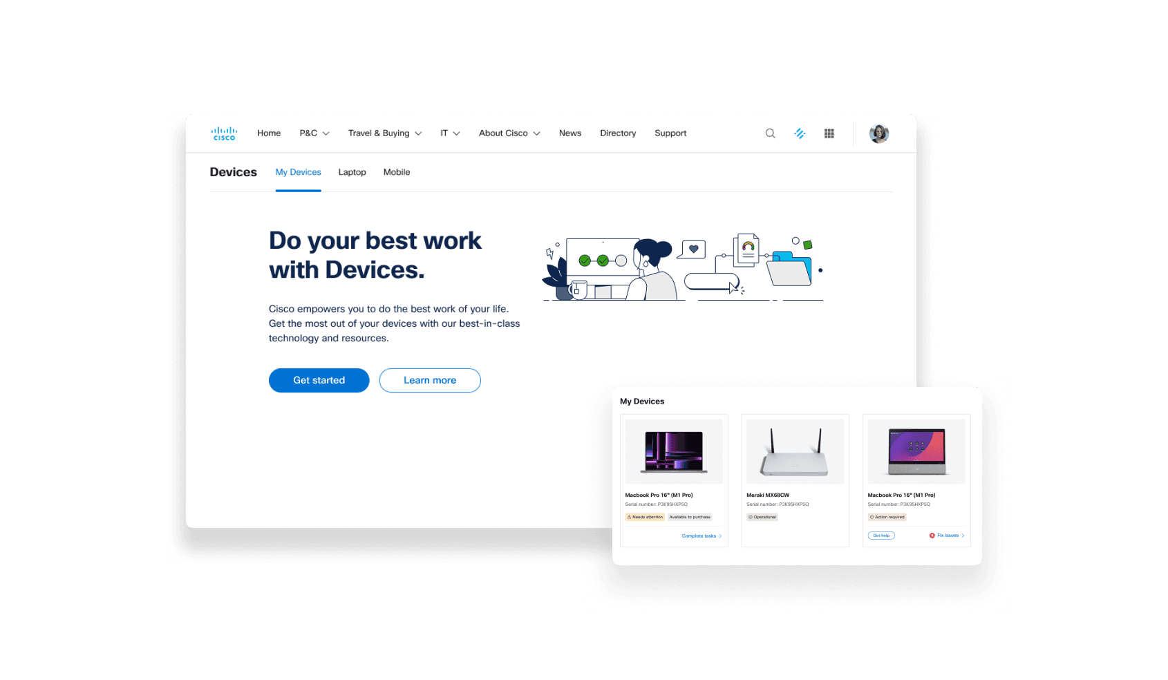
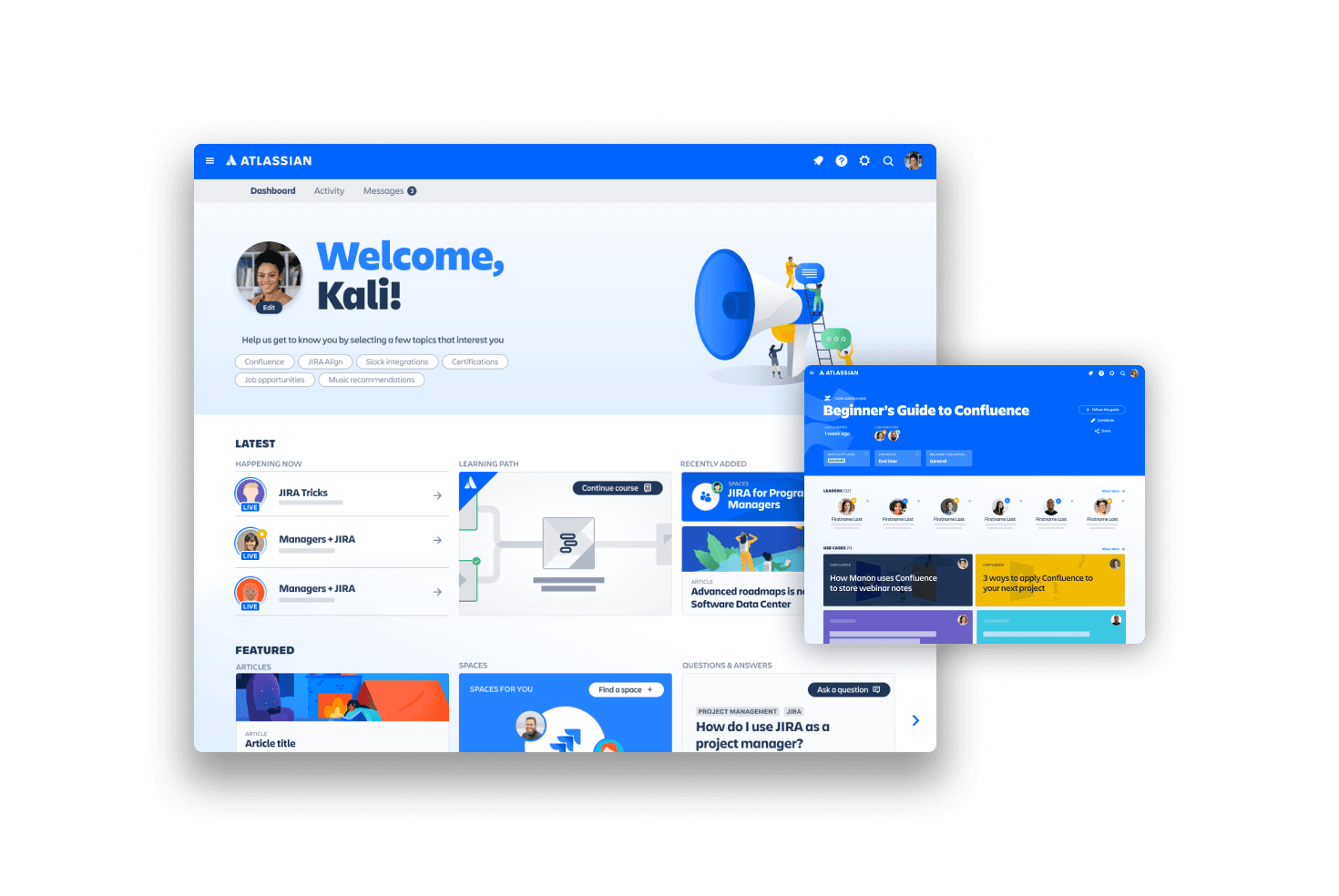
Some key screens post-redesign
Current state
Devices was hanging on by a thread
We knew something was broken, but we had to zero in. I combed through existing research and data to see the potential gaps and opportunities and identified three main focus areas:
Discoverability
51% of users who struggle to complete tasks "can't find what they need."
The content and UI choices may not have been meeting our users' mental models.
Scalability
Our site was built quickly to satisfy our stakeholders, and new features were added in like a patchwork quilt.
The structure of the site was limited and couldn't support new feature requests.
Performance
Our task health score was 65%, partly due to bugs.
While trying to complete tasks, the site would often crash or time out, and users would be left at a dead end.
Our simple, text-heavy site (pre-redesign)
Approach
Designers are product owners, too
This was a design-led project, starting from problem identification all the way through roadmap creation and execution. My three-pronged approach set our baselines, kept us aligned, and helped meet our targets.
Discoverability
We needed to meet our users where they’re at by elevating popular tasks, revising our info architecture, and using familiar patterns.
Scalability
This restructuring needed to support future stakeholder requests and allow our design team to keep up with Devices' growth.(see: templates case study)
Performance
A new UI is nothing without a good foundation. That's why I made site reliability a priority to reduce errors and improve load times.
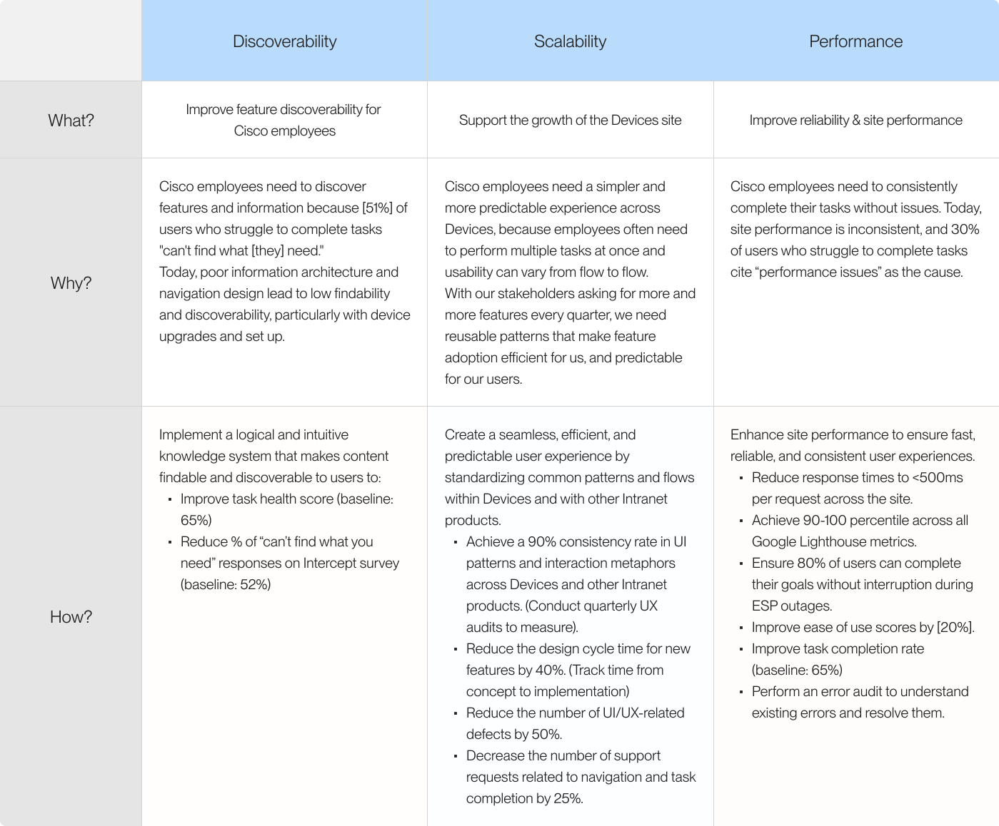
The core goals and metrics from the plan-of-action I created. Check out the full document, with defined features, epics, and stories to be created in Jira.
How do we actually get this done?
Using dual-track agile methodology
We split our team into two groups: myself and a content designer would focus on the redesign, and the others would work on regular Jira tickets that flow through our backlog. We were like a bunker within the larger team, creating Jira tickets and tracking them like any other project.
Solution
A new Devices, one that meets users where they're at
I helped build a scalable, intuitive platform that elevates key actions, keeps performance steady, and increases task completion rates.
Our new site structure, with a new quick-actions menu and improved resources on the secondary nav pages.
Homepage + Laptop Island pages
Device details page
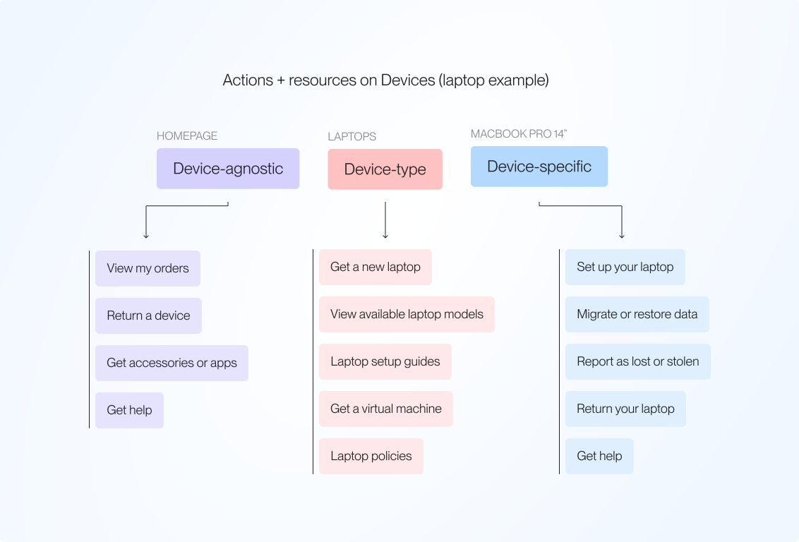
We explored the relationship between different types of actions on Devices. Some actions are tied to a specific device, others to a device-type, and the rest might fall into a general category. Users' mental models are heavily influenced by this relationship, so it was important that we got this right.
outcome
Improved discoverability and task health
With this work, we were able to get our task health scores up by 15%. Now, only 30% of users attribute task failure to "couldn't find what I need". Open-ended responses show that this now has little to do with findability, and more to do with unclear expectations of what users can do on Devices.